
THE WORK
000 / 100
Start your own
Chat on WhatsApp
A fine-dining restaurant brand built around ceremony and warmth. The identity draws from classical Indian motifs — an elephant mark framed in an arch, gold on deep charcoal, a system that lives equally on menus, crockery, and signage.
A dessert brand that needed to feel indulgent, modern, and a little playful — all at once. We designed the wordmark, illustration system, and packaging language to carry across boxes, bags, and social.
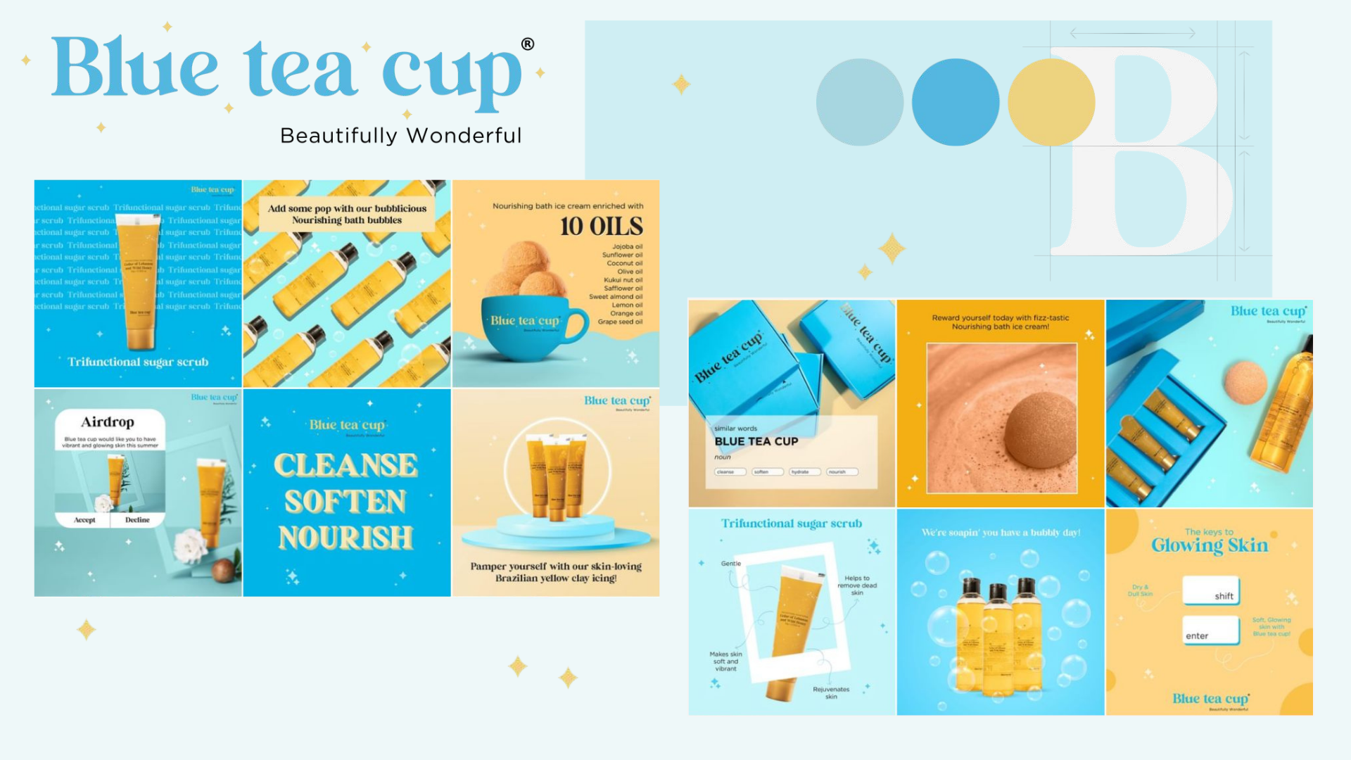
A bath and body brand built around softness and ritual. A delicate serif wordmark with a quiet shimmer mark, pale blue palette, and a brand voice that sits somewhere between a poem and a product label.
A plant-based brand that needed to look premium without looking preachy. The wordmark integrates a leaf into the letterform, anchored in a warm olive-green palette that reads clean on shelf and screen.
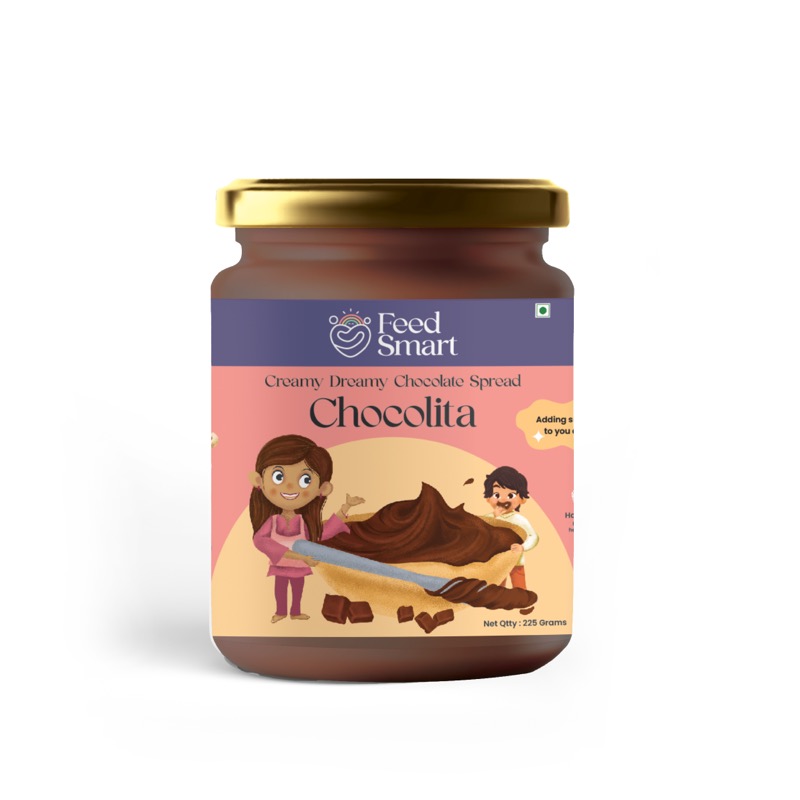
Packaging design for a children's chocolate nutrition product. The brief was clear: make it feel trustworthy for parents, delightful for kids. A warm illustrated label with clean ingredient hierarchy across jar sizes.
A coffee brand that wanted warmth over edge. Brown and blush pink, a wordmark with just enough character, and a visual identity system that scales from espresso cups to takeaway bags to a menu board.
A street food brand that needed a personality as big as its portions. Retro illustrated characters, a bold yellow palette, and a brand system built for kiosks, food trucks, packaging, and social — all at once.
A warm, whimsical bakery brand built around the idea that every bake is a memory made. The identity uses a distressed wordmark with a bee character, anchored in a deep maroon palette — sweet, nostalgic, and entirely its own.
An artisan food and beverage brand that needed to balance craft and accessibility. A flowing blue script wordmark, clean supporting type, and a packaging system built to grow with the product range.